
Limerick Animal Welfare
Website Redesign
(2020)
This project brief was to redesign a modern, user-friendly website for the charity ‘Limerick Animal Welfare’ through UX design and research. This was a project for a User Experience Design module in college.
This was a group project of two people where we used personas, scenarios, experience maps/customer journey maps, competitor benchmarking, storyboards, and a vision document to get an understanding of the users and to identify their needs. We designed the app through wireframing and prototypes created on adobe XD.

User Research

Vision Document
This was to focus on what tasks and implementations we felt were necessary to ensure we captured and developed the desired design. It was also a necessary step in order to remind ourselves of the connection between the current and future users of this website.
We wanted the redesign of this website to have an improved user experience with a modern aesthetic. We wanted anyone of any ability to be able to navigate the website. We wanted to bring the company and it’s users closer together through the use of their website.
Old Website Site Map
We used site flows to get a better understanding of the current website navigation, as well as we use it as an indicator of what content is currently on the website.


Experience Mapping
We used user experience mapping and customer journeys to identify the pain points of the tasks that the user was asked to complete on the current website. This allowed us to identify the problems and when exactly they happen.
Competitor Benchmarking
We compared Limerick Animal Welfares website to other companies in the same sector using a list of the services and functionalities L.A.W had on their site, to catch trends in the sector and design the website accordingly.

5 Second Testing
This method was used to determine if users could recall something memorable from the homepage of the Limerick Animal Welfare website. This gave us an idea of what stood out on the website, and if it was clear that the website was for Limerick Animal Welfare.
We gave the participants a laptop and told them to study the home page of the website for 5 seconds. We then took the laptop away and asked them follow-up questions.
From what you saw, what do you think this website is about?
Could you tell us what was obvious or most eye-catching to you?
Could you tell me what the purpose or intent was of this page?
Both my project partner and I tested 3 people each.
Card Sorting
I conducted these card sorting exercises to organise the content of the website.
For the first card sorting exercise, I asked the 5 participants to sort the features on the cards based on how they think they should be grouped on the website. To decide what features I would put on the cards, I looked at the site flow as this shows the content currently on the site.
After they had grouped the cards, I asked them to name the groups. The purpose of naming the groups was to gain a better understanding of why they were being grouped in such a way as well as we could use these names for the headings on the drop-down menu/navigation bar.
Based on what groupings were most popular is how we decided to design our website, and using the headings given by the participants is how we decided to name the headings in the drop-down menu. The headings decided by the participants were ‘Home’, ‘About Us’, ‘Fundraising and Events’, ‘Donate’, ‘Contact Us’ ‘Rescue’ and ‘Our Animals’.
Second Card Sorting
For the second card sorting exercise, I gave the participants the headings we put in the drop-down menu which we gained from the previous card sorting exercise. I asked the participants to sort the cards in the order they think they would like it to appear in the drop-down menu.
As the most popular order made by the participants is ‘Home’, ‘About Us’, ‘Our Animals’, ‘Fundraising and Events’, ‘Rescue’, ‘Contact’, then ‘Donate’, this is the order we used.
Third Card Sorting
For the third card sorting exercise, I wanted the participants to organise the order of the subheadings under the heading ‘Our Animals’. The subheadings we wanted to put in order are ‘Dogs’, ‘Cats’, Horses, and Greyhounds as these are the animals in the sanctuary. We asked the participants to sort the cards in the order they would like them to appear on the drop-down menu.
As the most popular order was ‘Cats’, ‘Dogs’, ‘Horses’, then ‘Greyhounds’, this is the order we put them in in the drop-down menu list ‘Our Animals’.
Personas


Scenarios
From the personas we developed, I generated scenarios that show
how a user might use the website. The scenarios I used were looking for pet care information, adopting a pet or making a donation. From here we can see what contemplations and decisions a user makes while interacting with a website.
In the scenarios, the red boxes represent the different steps of the task that was set, the blue box represents questions we need to answer throughout the designing process, and the purple box represents extra notes for ourselves.

Storyboards
The storyboards are used as a visual representation of how a user may interact and use specific features. The stories we used were:
Tommy wants to volunteer for animals
Young boy asks for a dog for his birthday
Someone attempting to re-home a dog
My group partner created these storyboards.

Site Map of Redesign
The new site map redesigned using the card sorting exercise.

Design Process
Old Design

Our Redesign
Wireframes
We began by creating wireframes of the updated design.


First Iteration
In order to keep the old website’s character, we took great influence from what existed already to decide on the visual aesthetic.
Colour: For the colours, we decided to use a yellow-orange colour as it gives the feeling of joy, enthusiasm and togetherness that we associate with the charity. It is also a colour that is present in their logo. We contrasted this colour with a blue as it is a colour that compliments yellow/orange.
Typography: We chose the font families Roboto and Segue UI as we felt these fonts would ensure good readability. These fonts share similar structure and shape.
Usability Testing
For our usability testing, we set out two tasks.
Adopting a pet
Reporting a dog they found.
The reason we are usability testing is to gain an understanding of how users would interact with our current design and to make changes to the design of the app based on the results.
Final Design

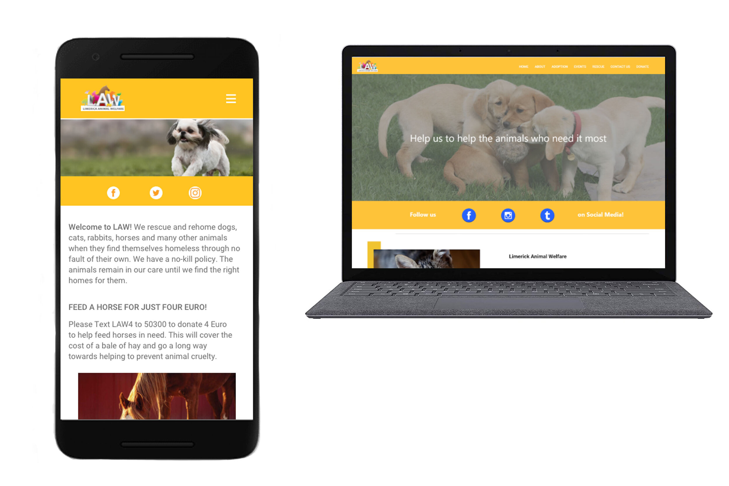
Home
This is the home screen where the user can find most general information about the charity. By clicking the burger menu the user will be shown a drop down menu where they can access all the other pages of the website. Also, by clicking on the icons in the center of the page, the user can access the charities social media.
Adoption
This is the adoption page. The first screen gives the user a list of all the dogs available for adoption, with a brief description. The second shows the drop down menu where they can choose which animals you would like to see next.
The third image shows a more detailed profile of the dog the user chose when they click ‘learn more’ on the first image. When you click adoption it will bring the user to the fourth screen where it gives the user the charity’s contact details or the option to direct message them.

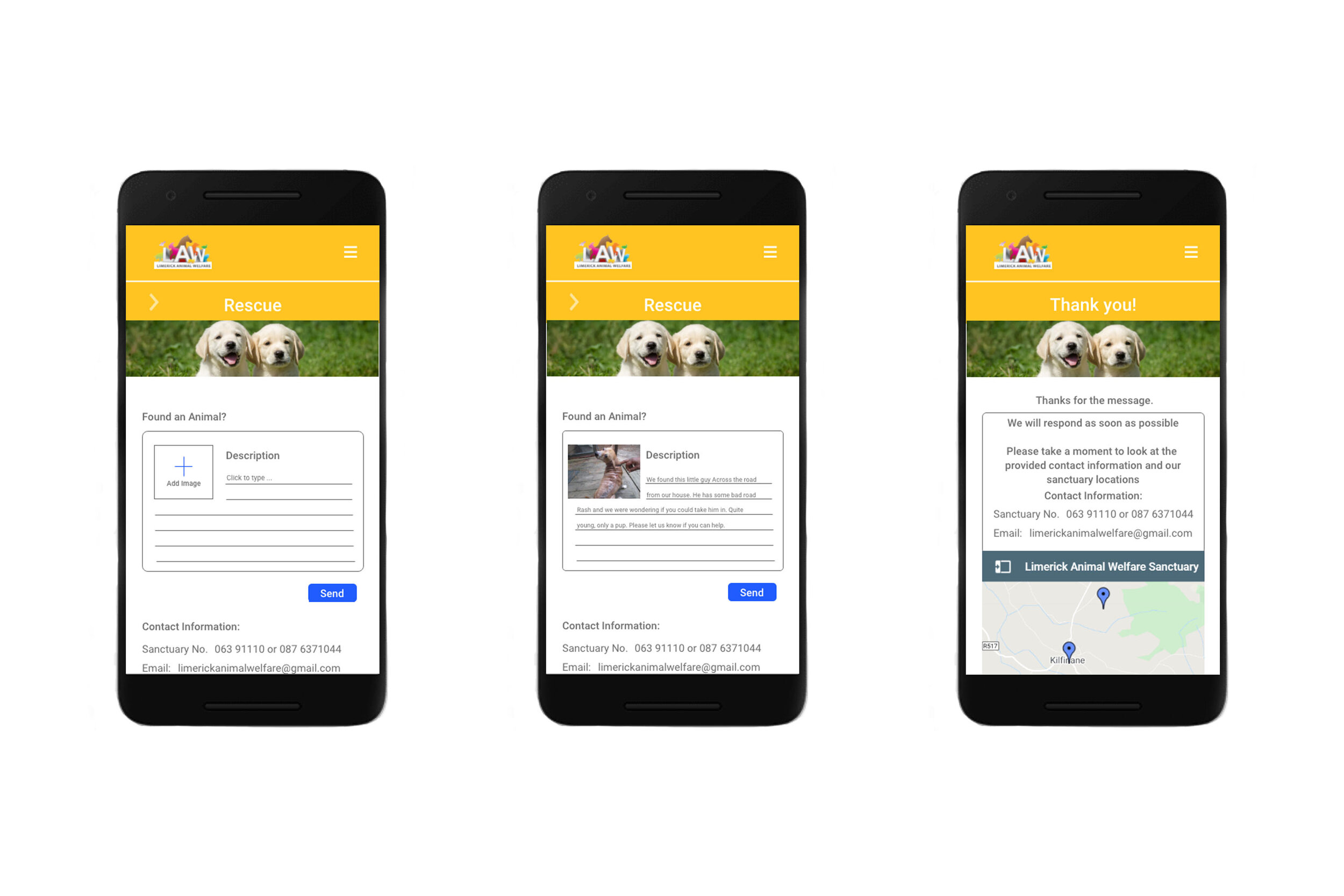
Rescue
This is the rescue page where the user can report an animal that they have found. They can post a picture, and give a description of the animal such as where it was found, the breed, and what condition it's in.
The charities contact information is also given here.
Donate/Contact Us
The first two images show the charity’s contact page, here it gives their contact details as well as allows the user to email them from their website.
The social media icons are also available here which allow the user to go straight from the website to the charity’s social media pages.
This page would also show the user a map of where your sanctuary is.
The second two images are of the donate page where it gives the user the charity’s bank details as well as allows the user to donate straight from the website.
The donate page also has a drop down menu that gives the user the option to see what else is on the page as well as allows them to get to that feature quicker by clicking on it.

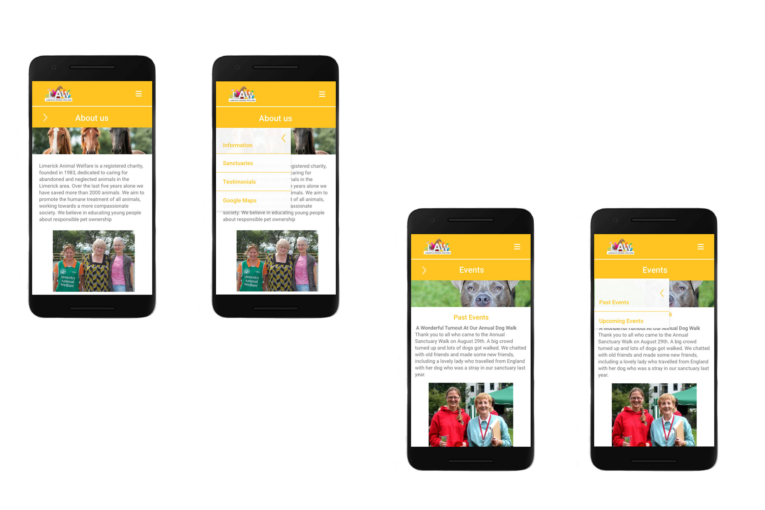
Events/About Us
The first two images are the about us page which gives the user information about the charity and what they do.
The second two images are the event page which shows the user what events are coming up as well as what events have passed along with images.