
Assignment Ace
We created an assignment alert app called ‘Assignment Ace’. The goal was to create an app that would promote students’ academic career by laying out and encouraging assignment submission up until the due date. We did this through notifications, an assignment submission date timeline, a feature that tracks the submission of other students in the module, and a chat feature.
Our idea was heavily inspired by our own negative experiences with the University of Limerick’s current Learning Management System ‘Sulis’. We felt the current design was out-dated and we wanted to create an app to motivate students with their work.
User Research
Competitor Benchmarking
Habatica: An app with in-game rewards and punishments to motivate you, and a strong social network to inspire you. But it relies on the user being dedicated enough to spend time inputting data.
KanbanFlow: KanbanFlow is a project management tool based on the Japanese Kanban method, which uses visual boards to improve communication and productivity. Users must input data and follow notifications to stay on track.
Google Calendar: A scheduling calendar with a simple interface for managing timetables, meetings, deadlines, and personal reminders like travel and birthdays. Students can create assignment calendars but must manually gather details from Sulis, emails, websites, and Dropboxes. It may struggle to stand out among other calendars or be forgotten if not regularly updated.
To-Do-ist: A to-do list app that syncs across all devices, helping track tasks, chores, and events. It has a simple interface that organizes tasks into projects like work, personal, and errands, with due dates, labels, and reminders.
Freedom/Cold Turkey/Crackbook: All distraction blocking apps or extensions that will either block you on a timer or permanently, reducing the ease to get distracted.
Google Drive: A simple file organiser for students, teachers, and workers, providing easy access to personal, shared, and teacher files. Supports various formats like Word, Excel, PowerPoint, photos, and videos across multiple applications.
Evernote/Google Keep: These platforms are great for storing class notes, to-dos, lists, and essays, with multi-platform access both online and offline. They make organising and searching easy but can be time-consuming to maintain.
SULIS: UL's Learning Management System. It is run by UL's IT Division. Some lecturers (but not all) are currently using SULIS to communicate with their students. SULIS facilitates communication and assessment with students of a particular module.
The Problem
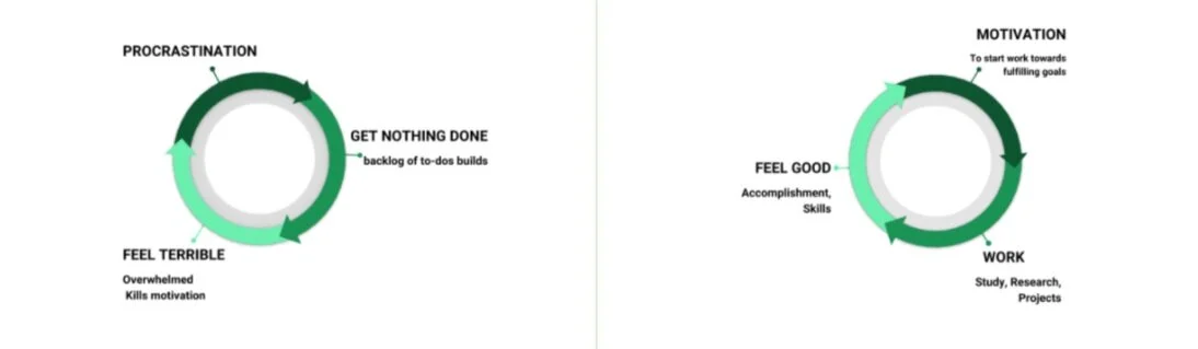
While brainstorming for this design space we explored the relationship between:
Motivation
The good feeling of getting work accomplished
Procrastination
We focused on college work and how the build-up of tasks due to procrastination can lead to incomplete and late assignments - all of which in turn can lead to an endless cycle of procrastinating, getting nothing done, and then feeling terrible. While if you’re motivated, the work gets done, and you feel good.
Interviews
To recruit people to take part in our interviews, we asked UL students, non-UL students and the UL lecturers, by word of mouth and text. These were scheduled semi-structured interviews. For the non-UL students, we had to email the questions to them as we were not able to meet in person.
We asked the students and lecturers of UL questions about their current Learning Management System ‘Sulis’ as well as how they organise different aspects of their life and if they could improve their organisational skills.
We asked students outside UL about how they would access information about assignments and if they think it is effective as well as questions on if they think it could be improved and how.
Everyone in the group Interviewed 3 people each.
Results:
Overall we found that UL Students and lecturers disliked Sulis some examples of why they dislike the website would be that there is a timed log out, it is difficult to input and find information, no alert system if something is posted, it has an unpleasant appearance, and a very bad mobile layout.
Usability could be improved by enhanced information architecture, a sense of community, improved ease of use, and more information regarding your module and lecturers.

Affinity Mapping
We went through all the interview transcripts and identified everything that was said about Sulis and put them on post-it notes, before identifying the main points made and marking them with an asterisk.
We accumulated all the other platforms that are used by lecturers in UL and in other colleges together. We looked at the positive traits that these platforms have that we could use.
We then re-sorted the notes between Lecturers’ experience and Students’ experience and divided the experiences into good and bad. We looked for the most important needs of both student and lecturers.
Usability Testing
One group member carried out a walkthrough task to time how long it takes for a student to set up a personal google calendar. Collect 5 different assignments details from 4 different places and insert them into the calendar and add notifications.
Time taken was 17 minutes. A student could possibly have up to fifty assignment submissions per academic term so we felt this was too time consuming.

Proto-Personas
One persona needs connection and engagement with peers and teaching staff within the field of interest
The other persona needs organisation and help from others on the course.
Story Boards
The storyboard I created was a user procrastinating while watching TV. They get a notification on their phone and realise how close a deadline is the next day. The user then starts working and in the end submits their assignment on time.
The other storyboard is a user hanging out with friends, they receive a notification saying that the assignment is due in 8 weeks, they ignore the message and continues hanging out with friends. A few weeks later, they receive another notification, they then start the assignment and have it in on time without stress.

Design Principles
We then identified the design principles for the project
Limiting: Don’t try to fix all problems or all findings, even if easily do-able.
Design for all: Design for all people in the learning system, not just for UL students.
Predictability: Being predictable in early stages makes the system easy to design.
Balance: Designing an app that will solve similar, key problems equally.
Human Scale: Designing an app that can be used with one hand.
Repetition & Rhythm: Using the same elements of design throughout the app.
Movement: Using movement to create flow in the design.
Contrast: Creating contrast to make important features & aspects stand out.
Fit for Purpose: Creating an app that achieves functional requirements above all else.
No Unnecessary information, content, menus or access.
Visuals: Use visual cues along with as well as keywords.
Less is more: Design interactions between the student and the lecturer. Minimalist design of User Interface
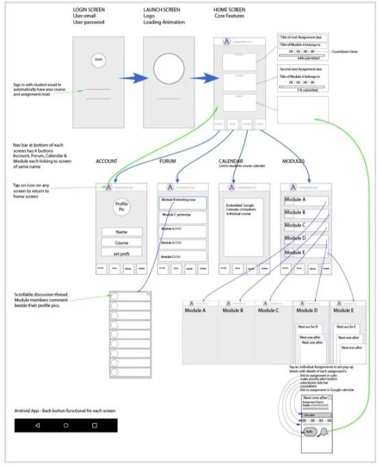
The core functionality of Assignment Ace
This Mobile Android App is the go to place to
Find out immediately:
1. Which assignment is due next
2. Which assignment is due second
3. Be reminded which assignment needs your attention according your own priority setting.Timer countdown to assignment submission times
View of real time total class submission uptake on assignments
Access a dedicated Class forum - only course material and course related topics. Find out what classmates & lectures are discussing about assignments in a distraction free place (this encourages and stimulates engagement in the assignments and fosters a sense of belonging to class group.)
Get a direct link to your own dedicated course Google calendar
Design Process
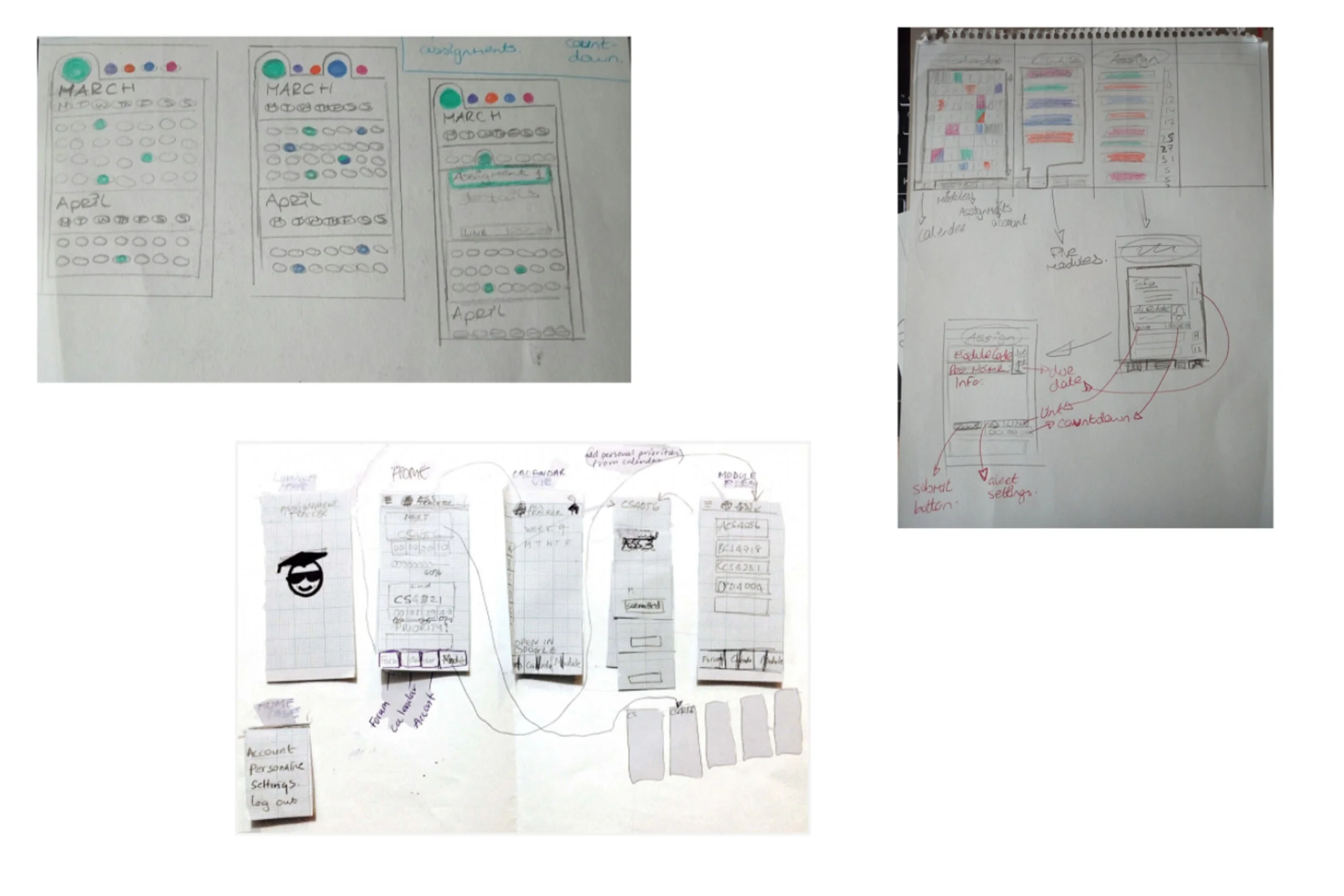
Sketched Wireframes
Digital Wireframes
A diagram of navigation between wireframes of each page of the app.

Lo-Fi Prototype and user testing
We created our Lo-Fi prototype on Marvel.
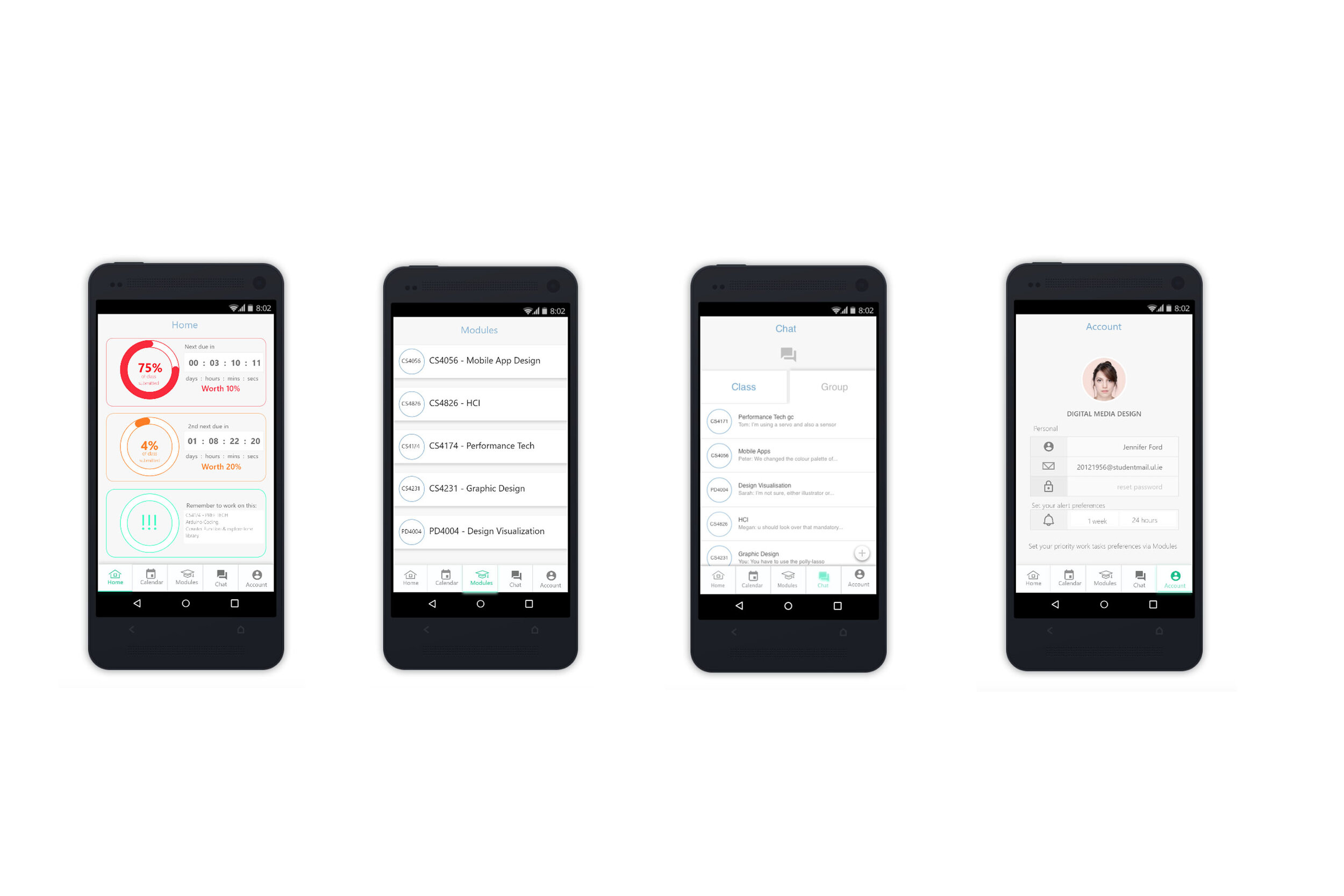
The screens you see here are the five main screens of the application - Home; Modules; Forum; Calendar; and Account.
We user tested it on UL students by allowing them to use it freely, and asking them to comment where they think they should. We took notes while watching them interact with the prototype.
We used these notes as feedback we could use for the next prototype.
Hi-Fi Prototype
We created our Hi-Fi prototype on Sketch.
The screens you see here are updated versions of the previous prototype screens. For ‘Home’ we added in an image and updated the visuals that show the user up to how far they have completed the assignment. The first graphic is the assignment the user has prioritised the most, you can choose to prioritise an assignment by in ‘Module’ and selecting the assignment. The second graphic would be the assignment that the user has put as their second priority etc…
The second image is a list of the modules, when one of these modules is clicked on, you are shown the list of assignments for that module. The third image is a chat screen, this was originally a forum, but based on our user testing, we changed it to a chat feature.


The first image is the updated calendar screen. This gives a list of the assignment circled on the calendar, so you know what assignment you are seeing. The second image is the updated app screen, we added an image element, and made it look more link an account than the previous prototype.
User Testing the Hi-Fi Prototype
For this user testing we gave the users tasks to complete:
Find the assignment you want to set as a priority and set it as priority.
Find out what your very next assignment is and how long is left for you to work on it before the submitting date.
We then followed up with a short interview where we asked the participants:
What stands out or appeals to you?
Did anything stand in your way or complicate your usage of the app?
Did any text, logos, icons or anything else confuse you?
Was anything missing from the app? Is there something in it that shouldn’t be there?
Using this feedback as a guide, we then updated the prototype to create our final design.

Final Design
Home Screen
The home screen was also redesigned to have a ‘traffic light’ effect to it. This was to make the
interface look cleaner and organised than the low-fi design, which used a purple colour. The most important assignment would now be a red colour to signal that it was the highest priority and was due next. Orange was designated to the second assignment to mimic a traffic light. Lastly, green was used as the least prioritised assignment.
The assignments pop-up was also redesigned to incorporate the new traffic light motif. The link to the assignment page was removed for simplicity. And the ‘Submit’ button was replaced with the word ‘Done’.
The navigation bar was changed to have 5 icons instead of 4.


Assignments
The first image shows the module page, once the user has picked the module they want to look at in more detail a drop-down was designed to show all the assignments for that particular module, this is seen in the second image.
The third image shows a pop-up. This pop-up shows when a user clicks on one of the assignments in the module, it gives the user details of the assignment as well as gives the user the option to prioritise it, or click that it’s done.
If the user says it’s done, the assignment will appear with the word ‘completed’ next to it in green. You can see this in the second image. Also, if an assignment is incomplete, the assignment appears with the word ‘incomplete’ next to it in red this is on-brand with the traffic lights on the front page. If the user clicks the bell to prioritise an assignment, the assignment will be moved to the home page, this is seen in the fourth image.
Chat
These are the screens i made specifically.
The idea for theses chats is to allow students to interact with each other by asking and answering questions posed by peers. Each member of the module is added to these chats.
Since the last user testing session, I added a customisable chat option in the form of ‘Groups’. The users can create new chats specifically for group projects.


Calendar/Account
Calendar: The calendar was updated with the new colour scheme also and was designed to show the different assignments due date. The traffic light effect was implemented here again to keep the design connected at each step of the user experience.
Account: The account was changed since the lo-fi prototype to be more like screens seen on other apps e.g. Instagram, the user can update their profile picture, name, email and password on this screen. They can also set their own preference for the reminders of their prioritised assignment.